1. Introduction
Pad printing is a versatile and indispensable indirect offset printing process. From branding logos on promotional products and marking medical devices with critical information to decorating automotive components and electronic housings, its ability to print on three-dimensional, irregular surfaces makes it a vital technology across countless industries. While the mechanical process itself is a marvel of engineering, the ultimate success of a print job often hinges on a single, critical element: color. Achieving precise and, most importantly, consistent color is paramount for brand integrity, product quality, and regulatory compliance.
However, color matching is a nuanced challenge, often proving to be a significant pain point for pad printing machine operators and production managers. A color that looks perfect on one batch can inexplicably shift on the next, leading to costly reprints, project delays, and client dissatisfaction. This article aims to demystify the process by addressing the common challenges faced by pad printing professionals and providing a comprehensive guide with actionable tips to achieve consistent, high-quality color results. We will delve into the core principles of color matching, explore the variables that can derail your efforts, and outline a systematic approach to control, measure, and reproduce color with confidence.
2. Understanding Color Matching in Pad Printing
In the context of pad printing, color matching is the process of ensuring that the printed color on a substrate conforms to a predefined standard or reference. This isn’t merely about mixing a visually similar ink; it’s a technical discipline that involves managing numerous variables to achieve repeatable and accurate color reproduction. The role of color matching is to translate a brand’s specific color identity—often defined by a Pantone, RAL, or custom code—onto the final product, regardless of the substrate’s shape or material.
The demand for precise color consistency is widespread and critical in many applications. Consider the following examples:
- Branding and Logos: A company’s logo is its visual identity. A slight variation in the shade of “Coca-Cola Red” or “Tiffany Blue” can dilute brand recognition and convey a lack of quality.
- Product Labeling: In industries like medical devices or electronics, specific colors on buttons, ports, or warning labels are used for functional identification. Inconsistency can lead to user error and safety concerns.
- Automotive Components: The color of a printed symbol on a dashboard button must perfectly match the other components and maintain its appearance under various lighting conditions.
- Promotional Products: The entire value of a promotional item is tied to its ability to accurately represent a brand’s image.
The accuracy of the final printed color is not determined by the ink alone. It is the result of a complex interaction between three key factors: the ink, the substrate, and the printing environment.
- Ink: This includes the pigment concentration, the type of resin or binder, the solvents used, and its viscosity.
- Substrate: The material being printed on plays a huge role. Its color, texture, porosity, and chemical composition can all alter the final appearance of the ink.
- Environment: Factors like the lighting used for evaluation, the ambient temperature, and humidity in the print room can significantly impact how a color is perceived and how the ink behaves.
Mastering color matching requires a holistic understanding and control of these three interconnected elements.
3. Common Challenges in Color Matching
Achieving perfect color consistency is an ongoing battle against several challenging variables. Understanding these hurdles is the first step toward overcoming them.
- Ink Variability and Batch Differences: Even from the same supplier, it’s possible to receive ink batches with slight variations in pigmentation or base. These minor differences can lead to noticeable color shifts on the final product, especially for brands with very low color tolerance.
- Substrate Material Impact on Color Appearance: The substrate is an active participant in how color is perceived. A yellow ink printed on a white substrate will look vastly different than the same ink printed on a blue or black substrate. Furthermore, the texture (glossy vs. matte) and absorbency of the material can change the way light reflects off the surface, altering the color’s appearance.
- Environmental Factors: The printing environment is a silent variable that can wreak havoc on color consistency.
- Lighting: This is perhaps the most common challenge. A color that matches perfectly under the fluorescent lights of the production floor may look completely different in the natural daylight of a client’s office. This phenomenon is known as metamerism.
- Humidity: High humidity can affect how quickly the ink’s solvents evaporate, potentially altering the final color and finish.
- Temperature: Temperature affects ink viscosity. A warmer ink is thinner, which can change the ink film thickness deposited by the pad, thereby changing the color’s opacity and shade.
- Limitations of Pad Printing Machines and Equipment Calibration: The mechanical state of the pad printing machine itself is crucial. Worn pads, incorrect pressure settings, or an improperly etched cliché (printing plate) can lead to inconsistent ink transfer. Without regular and precise calibration, even the perfect ink and substrate combination will yield inconsistent results.
4. Tips for Achieving Consistent Color Results
A systematic and disciplined approach is the key to overcoming color matching challenges. By controlling variables in each stage of the process, you can build a reliable system for repeatable results.
4.1. Selecting the Right Ink
The foundation of any great print is the ink itself. Not all inks are created equal, and selecting the right one is the first and most critical step.
- Choose Inks Designed for Specific Substrates: Pad printing inks are formulated with specific resin systems to adhere to different materials. An ink that works beautifully on ABS plastic may fail to adhere to polypropylene or glass. Always consult with your ink supplier to ensure the ink series you choose is chemically compatible with your substrate to guarantee proper adhesion and durability.
- Understand Ink Opacity and Viscosity:
- Opacity refers to how well an ink can cover the color of the substrate beneath it. An opaque ink will show its true color even on a dark surface, while a transparent ink will be heavily influenced by the substrate color. The required opacity level is a critical piece of information for color matching.
- Viscosity is the thickness of the ink. It must be adjusted with thinners to suit your machine speed and environmental conditions. Incorrect viscosity can lead to issues like pinholes, poor ink transfer, or an ink film that is too thick or thin, all of which affect the final color.
- Use High-Quality, Consistent Ink Batches: Partnering with a reputable ink supplier is essential. High-quality suppliers have stringent quality control processes to minimize batch-to-batch variability. When starting a large project, it is best practice to order enough ink from a single batch to complete the entire run.
4.2. Substrate Preparation
The substrate surface must be pristine and receptive to the ink for consistent color and adhesion.
- Implement Surface Cleaning and Pre-Treatment: The substrate must be free of contaminants like dust, grease, or mold-release agents. This can be achieved through wiping with appropriate solvents or using an ionized air blower. For low-energy surfaces like polypropylene and polyethylene, pre-treatment methods such as flame treatment or corona treatment may be necessary to increase surface energy and promote ink adhesion.
- Test Substrates for Color Compatibility: Always perform a test print on the actual production substrate before committing to a full run. This allows you to see how the substrate’s base color influences the ink and to check for any unexpected chemical reactions or adhesion issues.
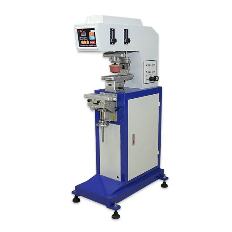
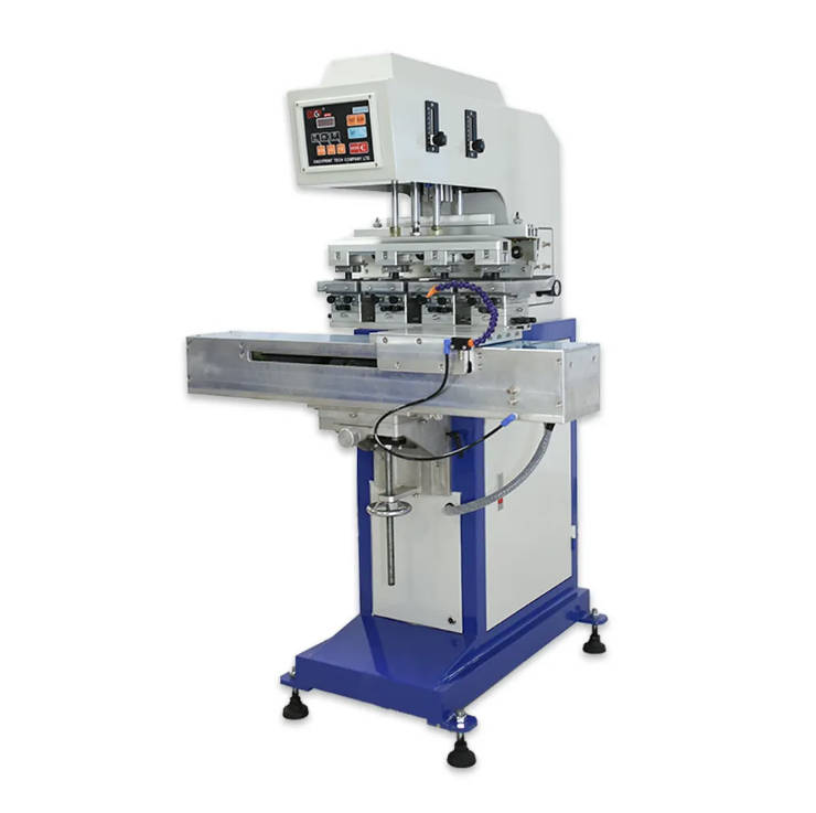
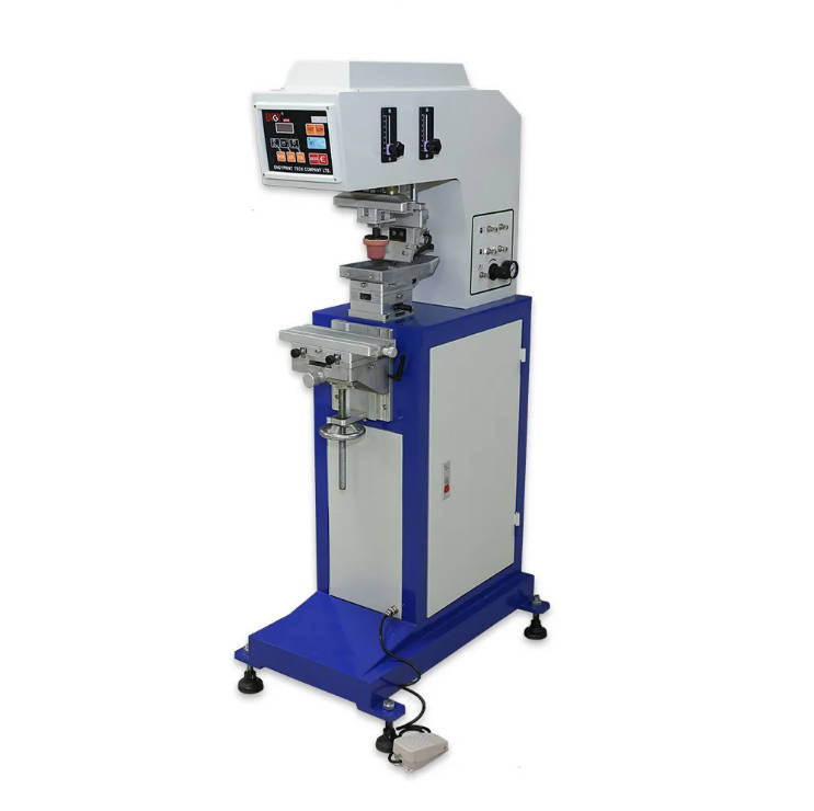
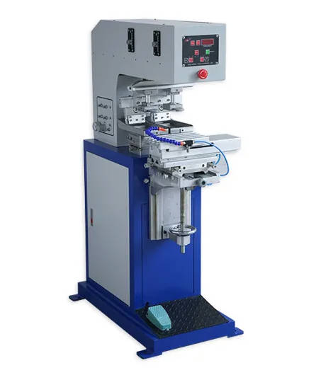
4.3. Machine Setup and Calibration
Your pad printing machine is a precision instrument. Treating it as such through proper setup and calibration is non-negotiable for color consistency.
- Properly Calibrate Your Machine: Key parameters that directly influence ink deposition and, therefore, color include pad pressure, cliché depth, and print speed. These must be set, documented, and consistently applied.
- Adjust Critical Components:
- Pad Pressure: Too much pressure can splay the pad and thin the ink film, making the color appear lighter. Too little pressure may result in incomplete ink pickup or transfer.
- Pad Hardness (Durometer): A harder pad generally deposits a thinner, sharper layer of ink, while a softer pad deposits a thicker, more opaque layer. The choice of pad can directly impact the final color.
- Cliché Depth: The depth of the etching on the printing plate determines the volume of ink that is picked up by the pad. A deeper etch holds more ink and will produce a more opaque color.
- Perform Regular Maintenance: A consistent machine is a well-maintained machine. Regularly inspect and replace worn components like pads and doctor blades. Cleanliness is also key; dried ink residue on the cliché or in the ink cup can affect performance.
| Machine Parameter | Effect on Ink & Color | Recommendation |
| Pad Pressure | Higher pressure can reduce ink film thickness, potentially lightening the color. | Use the minimum pressure required for a clean pickup and transfer. |
| Pad Hardness | Softer pads deposit more ink, increasing opacity and color density. | Select a pad durometer that suits the substrate shape and desired ink laydown. |
| Cliché Depth | Deeper etches hold more ink, resulting in a more opaque and vibrant color. | Calibrate etch depth based on ink opacity and substrate color. |
| Print Speed | Slower speeds can allow for better ink transfer and drying characteristics. | Optimize speed for a balance of production efficiency and print quality. |
4.4. Color Management Techniques
Moving beyond subjective visual checks to an objective, data-driven approach is the hallmark of a professional printing operation.
- Use Color Standards (e.g., Pantone, CMYK): Standardized color systems provide an objective language for communicating about color. Instead of describing a color as “sky blue,” you can specify “Pantone 2925 C.” This removes ambiguity and provides a clear target for the color matching process.
- Implement Spectrophotometers or Colorimeters: The most effective way to eliminate subjectivity in color evaluation is to use a color measurement device. A spectrophotometer measures the spectral reflectance of a color and provides precise, numerical data, typically in a format like CIELAB (L
ab*). This data allows you to objectively compare a print to a standard and determine if it is within an acceptable tolerance (Delta E). - Create and Maintain Color Profiles: For recurring jobs, create color profiles that document the exact ink formulation, substrate type, and machine settings used to achieve the approved color. This “recipe” becomes your starting point for future runs, drastically reducing setup time and ensuring repeatability.
| CIELAB Value | Description | Implication for Color Matching |
| L* | Lightness | Represents the black-to-white value (0 = black, 100 = white). |
| a* | Red/Green Axis | Negative values are green; positive values are red. |
| b* | Yellow/Blue Axis | Negative values are blue; positive values are yellow. |
| ΔE (Delta E) | Total Color Difference | A value representing the distance between two colors. A ΔE of < 1.0 is generally imperceptible to the human eye. |
4.5. Environmental Control
Your printing room environment must be as stable and controlled as the other parts of your process.
- Control Temperature and Humidity: Maintain a stable climate in your printing and ink mixing area.
A recommended range is often 20-25°C (68-77°F) with 40-60% relative humidity. This helps to stabilize ink viscosity and solvent evaporation rates, leading to more predictable ink performance. - Standardize Lighting Conditions for Color Evaluation: All color evaluation and approval should be done under controlled, standardized lighting. A light booth that can simulate different conditions (e.g., D65 for daylight, TL84 for office lighting) is a crucial tool for identifying and preventing metamerism.
4.6. Testing and Quality Control
Rigorous quality control processes ensure that your standards are met from the first print to the last.
- Conduct Test Prints Before Full Production: Never start a full production run without first running several test prints and getting approval on the color and quality. This is the final check to ensure all variables have been set correctly.
- Establish Quality Control Checkpoints: Implement a system for checking the color at regular intervals throughout the production run (e.g., at the start, every hour, and at the end of a shift). This helps to catch any color drift that may occur due to changes in ink viscosity or machine settings over time.
- Document Everything for Repeatability: For every successful job, create a detailed setup sheet that documents every single variable: ink formula (including thinner percentage), substrate batch number, machine pressures, pad type, cliché details, and environmental conditions. This documentation is invaluable for ensuring that the job can be perfectly replicated months or even years later.
5. Troubleshooting Common Color Matching Issues
Even with the best processes, problems can arise. Here’s a quick guide to troubleshooting common issues.
| Problem | Potential Causes | Solutions | |
| Color is too light or lacks opacity | – Ink viscosity is too low (over-thinned)<br>- Cliché is too shallow<br>- Pad is too hard<br>- Pad pressure is too high | – Reduce the amount of thinner<br>- Use a deeper cliché<br>- Use a softer pad<br>- Reduce pad pressure | |
| Color is too dark or bleeding | – Ink viscosity is too high<br>- Cliché is too deep<br>- Pad is too soft | – Add more thinner<br>- Use a shallower cliché<br>- Use a harder pad | |
| Ink won’t stick to the substrate | – Incorrect ink series for the substrate<br>- Substrate surface is contaminated<br>- Low surface energy of the substrate | – Consult supplier for the correct ink<br>- Clean the substrate thoroughly<br>- Apply pre-treatment (flame, corona) | |
| Color looks different under other lights | – Metamerism (ink pigments don’t match the standard’s pigments) | – Use a light booth for evaluation<br>- Work with your ink supplier to reformulate the ink using different pigments | |
| Color shifts during the production run | – Evaporation of solvent, increasing ink viscosity<br>- Temperature changes in the room<br>- Machine settings have drifted | – Use an ink cup with a lid; add thinner as needed<br>- Maintain a stable environment<br>- Re-calibrate machine settings periodically | |
| Inconsistencies across different substrate batches | – Variation in the substrate’s base color or texture | – Use a spectrophotometer to measure the new substrate batch and adjust ink if needed<br>- Use a more opaque ink or a base white layer | |
| Issues caused by environmental changes | – Fluctuations in temperature or humidity | – Install climate control systems in the print room<br>- Monitor and log environmental conditions |
6. Best Practices for Long-Term Consistency
Achieving color consistency is not a one-time fix but a commitment to a culture of quality.
- Standardize Processes and Document Settings: Develop Standard Operating Procedures (SOPs) for everything from ink mixing and machine setup to color approval and quality checks. Meticulous documentation is the foundation of repeatability.
- Train Operators on Color Management Techniques: Your machine operators are your first line of defense for quality. Invest in training them not just on how to run the machine, but on the principles of color theory, the importance of each variable, and how to use measurement tools like spectrophotometers.
- Partner with Reliable Ink and Substrate Suppliers: Build strong relationships with suppliers who understand the importance of consistency and can provide technical support and high-quality, reliable products. A good supplier is a partner in your success.
- Invest in Advanced Color Matching Tools and Software: While there is an upfront cost, investing in tools like a spectrophotometer, a light booth, and color formulation software provides a significant return. It reduces waste, saves time, and elevates the quality and consistency of your output, ultimately leading to greater profitability and client trust.
7. Conclusion
Consistent color matching in pad printing is a complex but achievable goal. It is a discipline that extends far beyond simply mixing ink. It requires a holistic approach that acknowledges the critical interplay between the ink, the substrate, the machine, and the environment. By moving from subjective visual assessments to a data-driven, scientific process, printers can transform color matching from a source of frustration into a competitive advantage.
The journey to perfect color reproduction involves continuous monitoring, process refinement, and a commitment to quality at every step. By implementing the best practices outlined in this guide—from careful ink selection and rigorous machine calibration to advanced color management and thorough documentation—you can ensure that every print meets the exacting standards your clients demand. Ultimately, mastering color consistency will not only improve your products but also enhance your reputation as a high-quality, reliable printing partner.